|
|
Post by Caliber on Feb 22, 2013 2:32:26 GMT -5
|
|
|
|
Post by Escachick357 on Feb 22, 2013 4:25:22 GMT -5
Before you add anything, can you make the pictures and text smaller. It's a little too big.
|
|
|
|
Post by Winters on Feb 22, 2013 4:31:03 GMT -5
Its lagging my screen like a mofo. Make them much smaller, and less compression so it loads better. Not everyone has a good computer, mines rather old. Good idea though, but yeah, make them smaller.
|
|
|
|
Post by Caliber on Feb 22, 2013 8:52:12 GMT -5
I can do that, but in keep in mind, there's only so much I can scale down before the text becomes straining on the eyes. Especially with the weird fonts.
I knew the graphics would stretch the screen of anybody with less than 1080p resolution, but I figured it wouldn't be a huge issue, considering the only people who are ever going to see the profile are me, the person who reviews it, then my future roleplay partners, so it's not like it's going to be a problem while it rots away in the Accepted board.
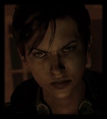
Btw, I know it looks like a lot, but there's only going to be 11 images up there. Because of the interlaced .PNGs, it looks like 20. The three largest images are about 900 kilobytes, the 3 smallest images are under 10 kilobytes, and the remaining 5 images are about 100 kilobytes, and everything is compressed to about maximum.
Still, I'll try to knock off a few hundred pixels or so here and there to optimize it. If you have a bad connection, or if Imageshack is acting up, the page might take a second or so to load. Guaranteed, however, even the oldest of computers shouldn't have trouble rendering 11 images with alpha channels.
EDIT:
There we go. Everything is approx 30% smaller.
|
|
|
|
Post by Winters on Feb 22, 2013 16:04:31 GMT -5
Right, if you were gonna edit it anyways, just edit it, dont need to explain everything. And if your gonna be doing the rest of your profiles like this, dont. Just do them normally like everyone else. Please and thank you. I dont mind a few images, but when the entire thing is images, thats excessive, and if prefer you didnt do it in the first place. Other people have wanted to do it before, and I told em no, cause it made it hard to read. You did it well, now it doesnt lag the screen at least.
|
|
|
|
Post by Caliber on Feb 22, 2013 16:56:09 GMT -5
Right, if you were gonna edit it anyways, just edit it, dont need to explain everything. Pardon me for trying to help you understand, lol. And if your gonna be doing the rest of your profiles like this, dont. Just do them normally like everyone else. Please and thank you. I dont mind a few images, but when the entire thing is images, thats excessive, and if prefer you didnt do it in the first place. Other people have wanted to do it before, and I told em no, cause it made it hard to read. You did it well, now it doesnt lag the screen at least. Huh. That's odd. N/A seemed confident that my creativity wouldn't be discouraged. Oh well. If it's honestly really so strenuous on the eyes of those with vision troubles, I could just include a transcript of all the info in a little quote box beneath the main post. That said, provided I made those accommodations, I really can't fathom a reason a person would object to me including (in addition) my "prettied up" version. |
|
|
|
Post by KR0R1C on Feb 22, 2013 18:14:24 GMT -5
Hey Cali!  Just want to start off by saying that I love the layout, and the creativity that went into creating it. I enjoy trying out new templates and things for my profiles and this looks nearly like a couple of mine but with the dial turned up a bit more. Love it! I cant wait to see the finished product. Plus I like the actor you chose for it! I didnt see it before you shrank it a bit. But I will say that the size it is now fills my screen perfectly and I would love to see more profiles made like this, its interesting and very different to the normal application. I think Joey is simply wanting it to stay smaller so its more a universal size, something that will fit on the majority of screen sizes which I would assume is something like 1024 nowadays. And if you would like to do a basic version and still have a prettier one as well. I too am currently doing that with a few character remakes I am working on. Making a pretty one and then a link to a more basic one at either the top or bottom of the post. So that would be totally acceptable if you feel like doing that. In my eyes the size and setup you have now is great. Anyway Im going to unlock this cause I really want to see the finished product. And more like it. Glad your back and keep up the innovative work!  And if you'd like ( i know i would) I will clean up the posts in here when it is accepted so all the above stuff isnt there. |
|
|
|
Post by NotAvailable on Feb 22, 2013 18:15:48 GMT -5
My monitor is flickering and fuzzy and my laptop is a piece of legit s***. And her profile is loading fine. I see nothing wrong with this profile, the pictures and the text are much smaller and easier to see the whole of. The boxes make it easier to look for certain information.
We've encouraged, YOU'VE encouraged creativity and I see no reason to tell her or anyone that they cannot do this. It's a profile, no one is going to see it but us and whoever decides to RP with her. C'mon staff, you know this is true.
As for you, Joey, what the hell was that comment? That was completely uncalled for, it's downright bullying. You told me, you PROMISED ME, that the character creation was all about having fun and being creative. I stopped b*tching about the rules because I understood and I and everyone else was enjoying themselves.
Everything you just said to her, after she'd done what you asked without b*tching, just an explaination, seemed antagonistic. Maybe it was, maybe it wasn't, but it sure as heck seemed like it. This was unfair. This was unprofessional and if you want to get rid of me too then I'm fine with that. I'm gonna protect the users and my friends from unjust calls. Like you said, it's about having fun and it's about letting people have thrive and write what they want.
This is the opposite of that. I see nothing wrong with it as is. It was a bit too big before but it's fine now. It's smaller scale, it's clear to read and understand.
|
|
|
|
Post by Caliber on Feb 22, 2013 18:33:20 GMT -5
Now that this is moved back out of Denied, I can make a proper closure post. I think it's clear that I no longer have a place on RERPG. If I can't even make a new character without getting antagonized, I think it really is time for me to go. I was looking forward to re-integrating into the community, hoping that I could put up with Rev's attitude, but he's commander in chief now, and it's his way or the highway. Perhaps I'm too proud to respond to everything with "Yes, SIR! Right away, SIR!", so that means it's "the highway" for me. Anyway, sorry for being dramatic. Hope you enjoyed the show. EDIT:I'm gonna finish this profile. Until then, I'll hold off on my decision to take a break from the site. Hey Cali! Just want to start off by saying that I love the layout, and the creativity that went into creating it. I enjoy trying out new templates and things for my profiles and this looks nearly like a couple of mine but with the dial turned up a bit more. Love it! I cant wait to see the finished product. Plus I like the actor you chose for it! I didnt see it before you shrank it a bit. But I will say that the size it is now fills my screen perfectly and I would love to see more profiles made like this, its interesting and very different to the normal application. I think Joey is simply wanting it to stay smaller so its more a universal size, something that will fit on the majority of screen sizes which I would assume is something like 1024 nowadays. And if you would like to do a basic version and still have a prettier one as well. I too am currently doing that with a few character remakes I am working on. Making a pretty one and then a link to a more basic one at either the top or bottom of the post. So that would be totally acceptable if you feel like doing that. In my eyes the size and setup you have now is great. Anyway Im going to unlock this cause I really want to see the finished product. And more like it. Glad your back and keep up the innovative work! And if you'd like ( i know i would) I will clean up the posts in here when it is accepted so all the above stuff isnt there. Thankyou. I appreciate the kind sentiments. My monitor is flickering and fuzzy and my laptop is a piece of legit s***. And her profile is loading fine. I see nothing wrong with this profile, the pictures and the text are much smaller and easier to see the whole of. The boxes make it easier to look for certain information. We've encouraged, YOU'VE encouraged creativity and I see no reason to tell her or anyone that they cannot do this. It's a profile, no one is going to see it but us and whoever decides to RP with her. C'mon staff, you know this is true. As for you, Joey, what the hell was that comment? That was completely uncalled for, it's downright bullying. You told me, you PROMISED ME, that the character creation was all about having fun and being creative. I stopped b*tching about the rules because I understood and I and everyone else was enjoying themselves. Everything you just said to her, after she'd done what you asked without b*tching, just an explaination, seemed antagonistic. Maybe it was, maybe it wasn't, but it sure as heck seemed like it. This was unfair. This was unprofessional and if you want to get rid of me too then I'm fine with that. I'm gonna protect the users and my friends from unjust calls. Like you said, it's about having fun and it's about letting people have thrive and write what they want. This is the opposite of that. I see nothing wrong with it as is. It was a bit too big before but it's fine now. It's smaller scale, it's clear to read and understand. Thanks for backing me up. I'm glad somebody sees things the way I do. |
|
|
|
Post by Escachick357 on Feb 23, 2013 0:09:35 GMT -5
Chances are that you won't read this, but I think it was an improvement. It's not straining on my eyes and the images aren't too big. However, I do have a slight problem with the images and that's that it takes a while for the images to load up on my computer (probably not your fault).
Next time you make a profile, could you try to make as few and small images as possible with at least mostly normal text so it's easy to read?
|
|
|
|
Post by Caliber on Feb 23, 2013 1:16:03 GMT -5
Chances are that you won't read this, but I think it was an improvement. It's not straining on my eyes and the images aren't too big. However, I do have a slight problem with the images and that's that it takes a while for the images to load up on my computer (probably not your fault). Next time you make a profile, could you try to make as few and small images as possible with at least mostly normal text so it's easy to read? I'm still here. Next time, I think I'll just fuse a bunch of the images together. I should be able to reduce the 11/12 images down to 5 images. People will still have to load the same amount of data, but it should at least be smoother, I think. |
|
|
|
Post by Mikey on Feb 23, 2013 14:44:48 GMT -5
Since Revolver saw fit to ban her, Caliber would like the first post of this thread deleted.
|
|


 And if you'd like ( i know i would) I will clean up the posts in here when it is accepted so all the above stuff isnt there.